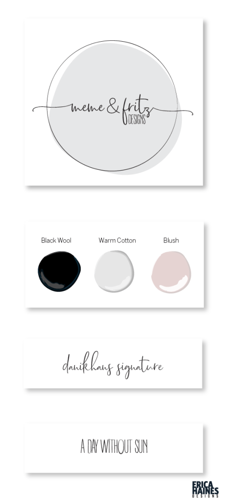
Meme & Fritz is whimsical and soft, feminine and youthful but not childish. Soft black and warm light gray keep it neutral and gray toned blush for a secondary color adds a soft pop of color. I absolutely adore this branding, with a handwritten script and thin capitals. The circle keeps everything enclosed and makes it easy to transition to multiple purposes – rubber stamps, fabric tags, social media profiles and website icons. The additional elongated version adds a variety to label apparel pieces without losing the details.