When Jenn reached out to me to concept her new business, I was so excited! With a passion for yoga myself, I knew there were so many directions to take a new studio. Luckily, she came to the table with clear, concise ideas and direction so jumping in was easy!

She came to me with an absolutely gorgeous story about her grandfather and his thought processes. His consistent reminder that one can “always get 32 more drops from the bottle” was the base for her company name and her love of sun in a plethora of ways inspired the sunny colors and whimsical yet clean design.


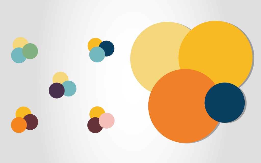
Working through a variety of themes, I knew I wanted to bring the name to the forefront of the design: a drop. Whether it’s the last few from her grandfather’s bottle of wine or the beads pouring down your face during an intense yoga session, the drop was central. Keeping it simple and clean to allow for readable images on social media platforms was essential as that was the focus for her marketing. Playing around with colors of the chakras, sun and ways to showcase the company name, the images below were a few variants on the theme.


