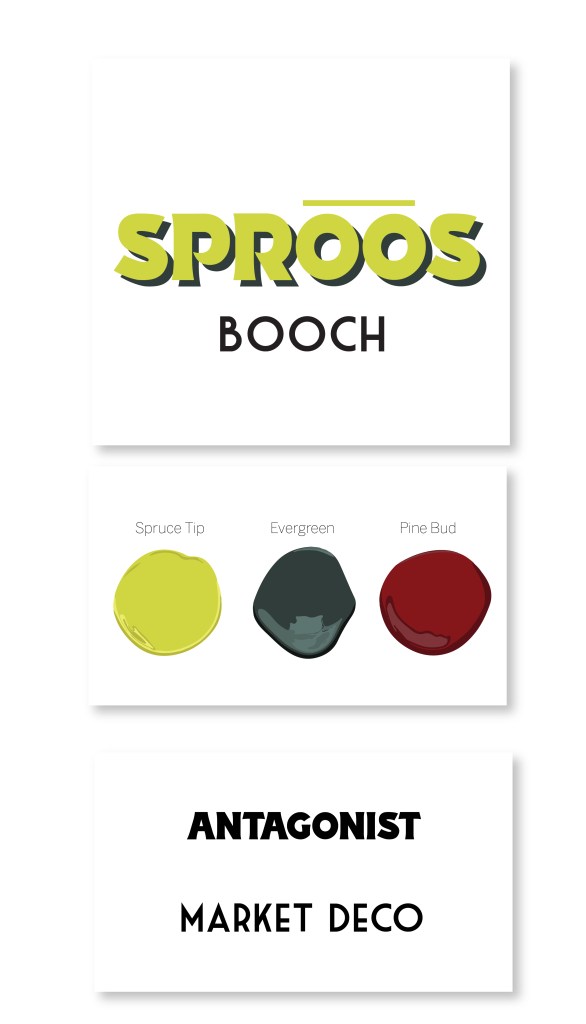
This can came about with the creation of a naturally fermented kombucha flavored with organic spruce tips and lemon peel. The design’s aim was to be bright and eye catching with a bold memorable logo. The colors were brought in from true colors of nature: the vibrant almost neon green of spruce tips in spring, the orange red buds of pine cones and the deep evergreen of a spruce tree. Whimsical trees on a modern gradient background create a bright can that pulls the eye.
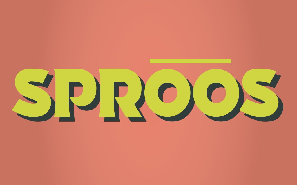
The font Antagonist is modern yet outdoors-y. The sweeps of the “P” and “R” are reminiscent of the budding pine and paired with the very vintage clean of Market Deco, the can is easy to see what it’s contents are. The demographic of this can does lend toward the feminine but the outdoors, sporty vibe grounded with the deep greens and russet can easily hang out in anyone’s hand.